HMRC – UX/UI

HMRC


The UK’s tax, payments and customs authority has a new in-depth cross-sector dashboard. Make informed data-driven decision empowered by outstanding data visualisation.


HMRC wants to transform their existent central Dashboard into an a new conceptual data driven platform within 9 different directorates. This project aims to create a bleeding-edge, transformational platform which will support employees in making better business decisions, ensuring a positive impact on the business performance without hassle by saving substantial time in the process.

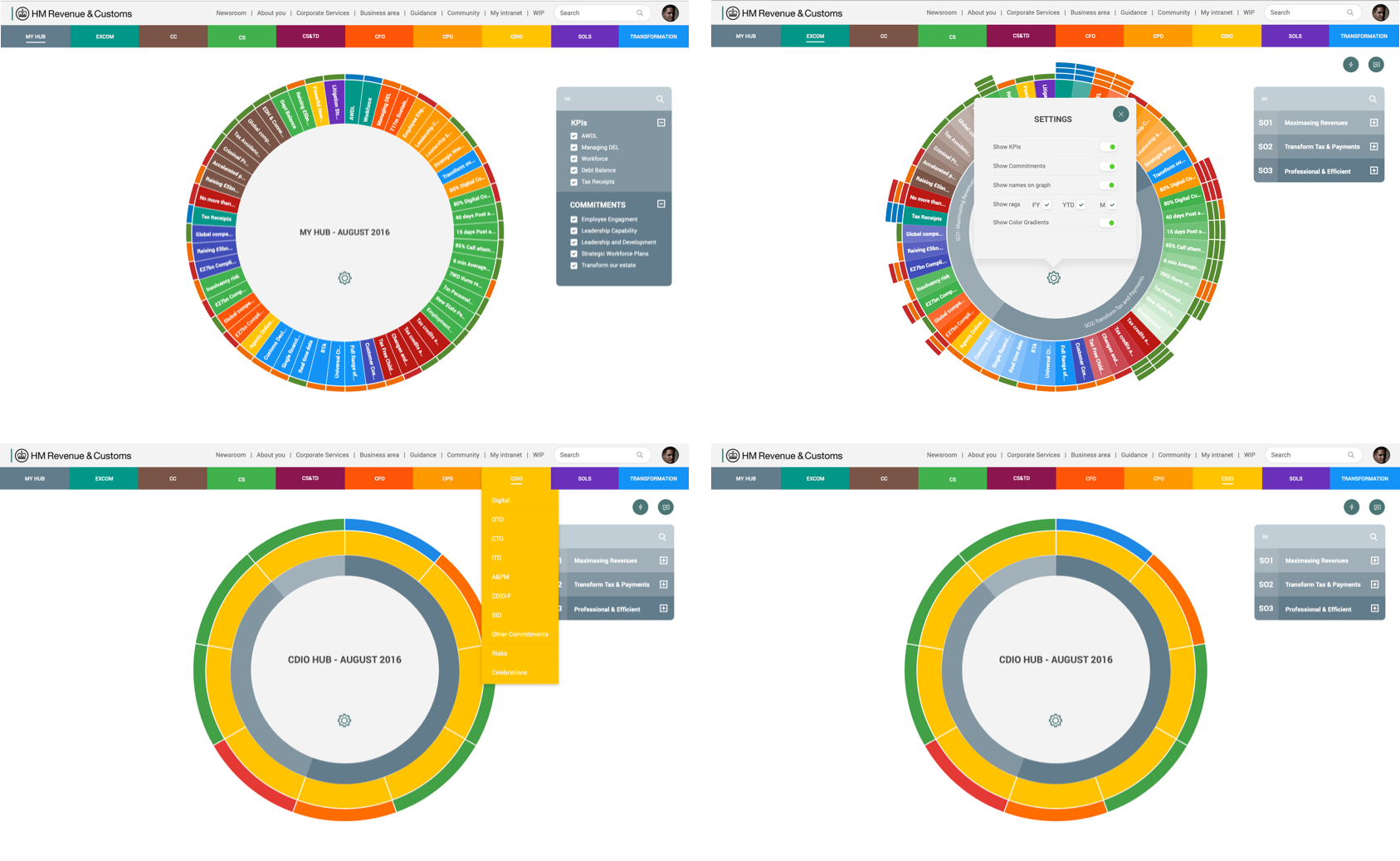
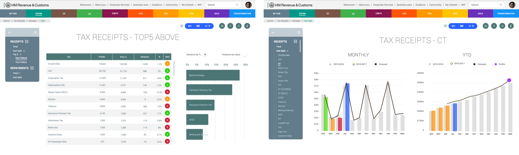
Working in an Agile team I worked as a UX/UI Designer implementing an advanced data visualizion solution that provides a better user experience. The world-class visualizations will support the delivery of distinct and differentiated insights from different government sectors i.e. TAX Receipts and Repayments, Governmental Programs, Various Government Budgets, etc... so data can be cross-referenced and integrated in order to generated cost-effective reports more rapidly. 

I also acted as an internal consultant providing advice on standards and best practice for overall data visualization. I provided advice and support across the Research & Insights teams for different projects. 


HMRC – UX/UI


I facilitated a workshop with stakeholders to understand objectives and validate concepts design drafts which gave me great insights on how to evolve the dashboard and which kind of visualisation would be more appropriated. Each participant had the opportunity to give their contribution on what they expect to obtain as result after gathering data from the Dashboard.

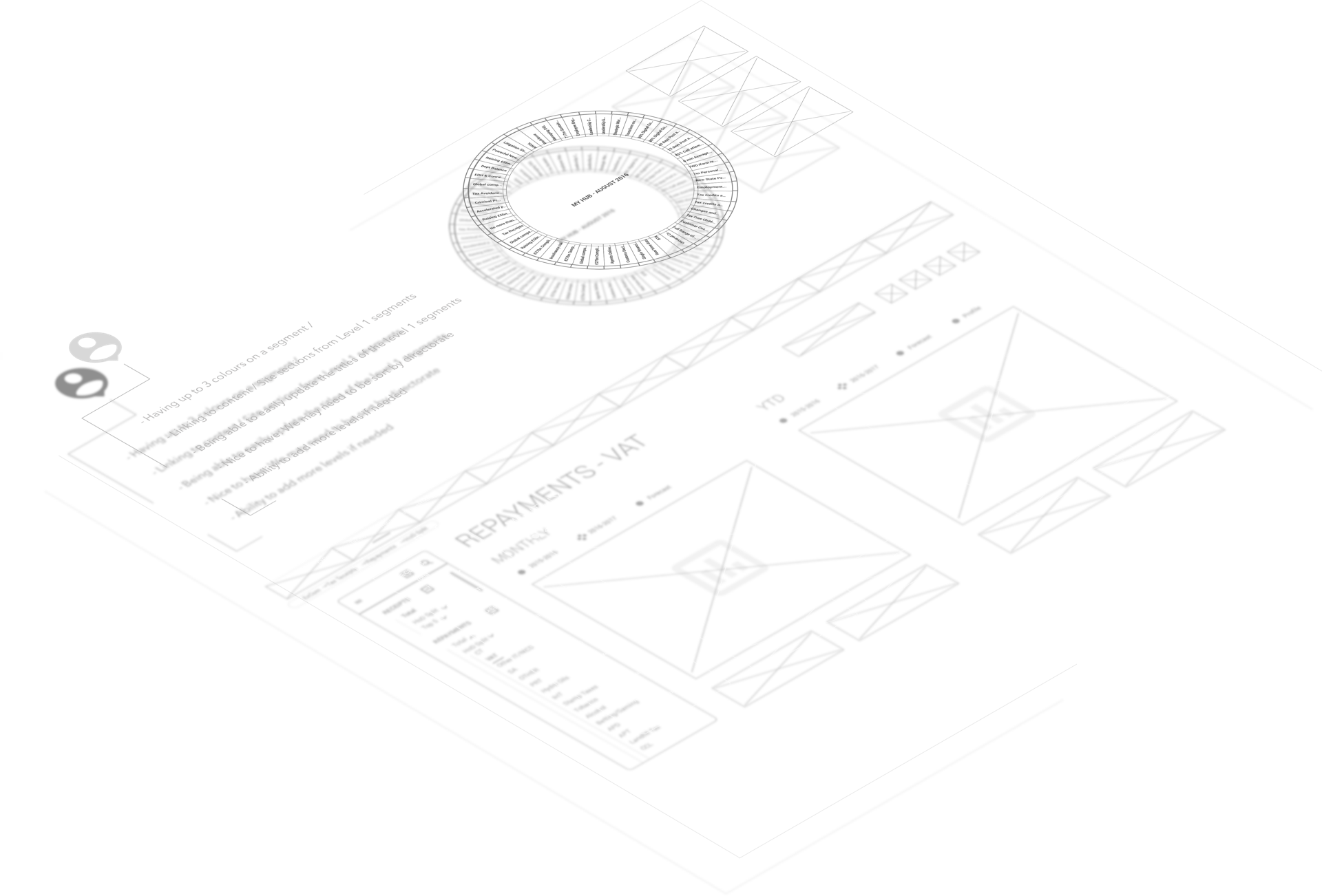
I designed and tested many exploration until the final one was chosen. During the process, after every iteration I was able to identify real user needs and pain points which were crucial to deliver a solution that fits the company needs.


HMRC – UX/UI
HMRC – UX/UI


As I had little time I established my own workflow which consisted of 2 week cycles. Over a period of 2 weeks I would collect feedback, Design, review , prototype, test, repeat. This life cycle gave me great control over every iteration of the Design.

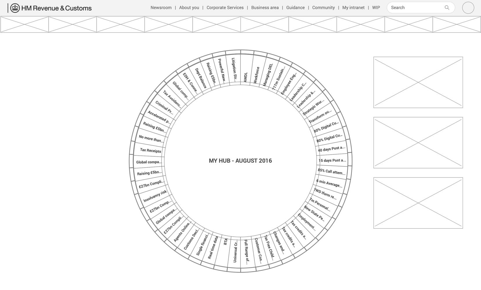
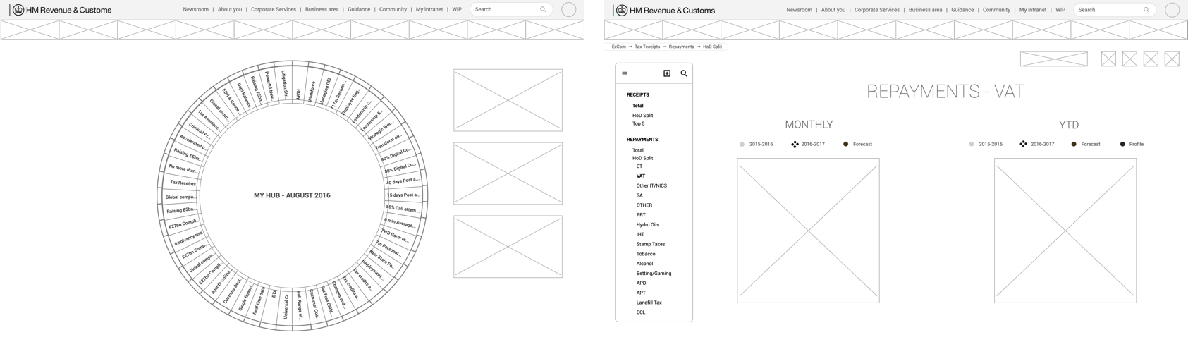
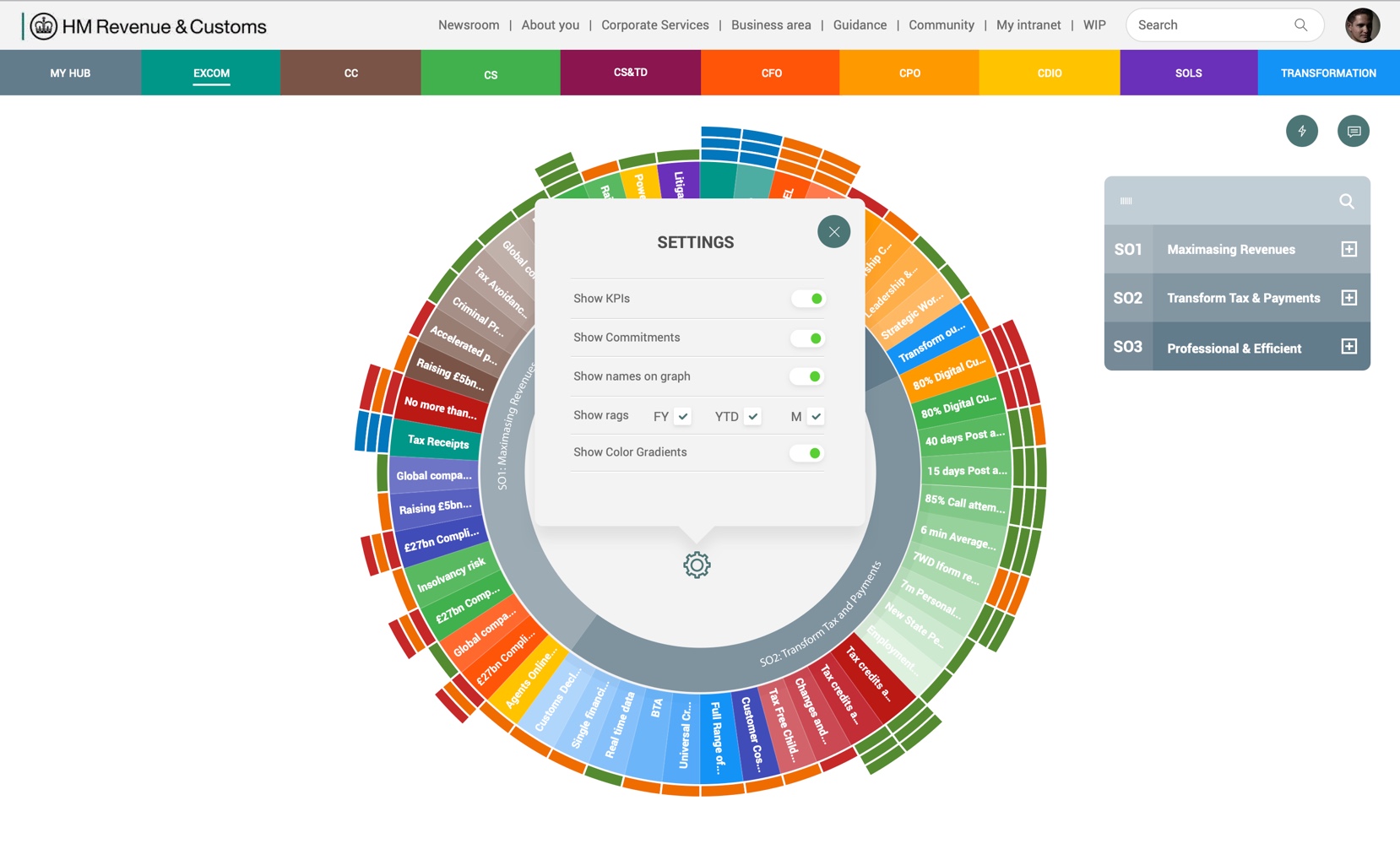
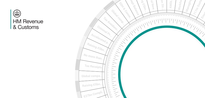
I was able to deliver a complex visualization Dashboard using a Sunburst chart using D3.JS, which is a JavaScript framework for complex rendering of data visualisation that is support on every web browser for desktop and mobile.


HMRC – UX/UI
HMRC – UX/UI


Every sector has its own bespoke interactive visualizations which users can save, share and live edit via browser. 


HMRC – UX/UI


A board of Q&As was evolved so users could provide support and help one another by keeping conversations organised in an accessible place. Users have the ability to communicate and delegate in a more effective way.


HMRC – UX/UI


Loading