Tiller – UI & Motion Design
Tiller Investments
Unlike any other automated investment platform, customers can build their investment portfolio with ease in a completely unique way.
CLIENT
Space01
MY ROLE
Lead UI
TOOLS
Adobe Illustrator, Photoshop, After Effects, Sketch and InVision
USER INTERFACE
It's not everyday that you get the chance to explore a very conceptual user interface design which instantly has a very positive feedback based user experience. I had a great opportunity to push the boundaries of how an investment platform should function by coming up with a concept that would provoke a memorable user experience.
User adoption is the key challenge when testing an unconventional interface so the concept had several levels of iterations until reached its final version.
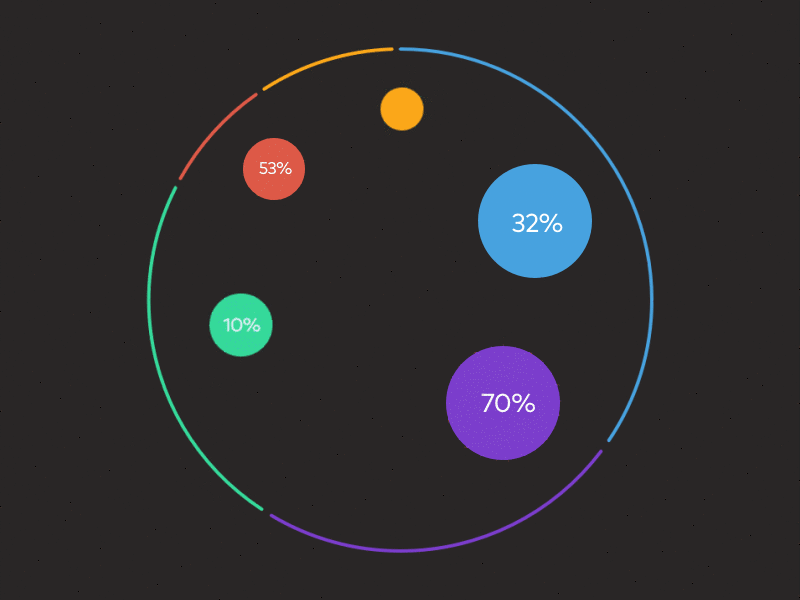
The circles and rounded stylised elements seen on the UI are part of the core brand visual identity so there is a perfect synergy between the brand elements and their purpose to the actual UI experience.
User adoption is the key challenge when testing an unconventional interface so the concept had several levels of iterations until reached its final version.
The circles and rounded stylised elements seen on the UI are part of the core brand visual identity so there is a perfect synergy between the brand elements and their purpose to the actual UI experience.
USER DISCOVERY
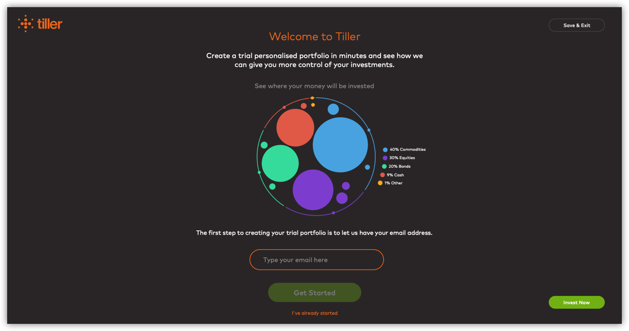
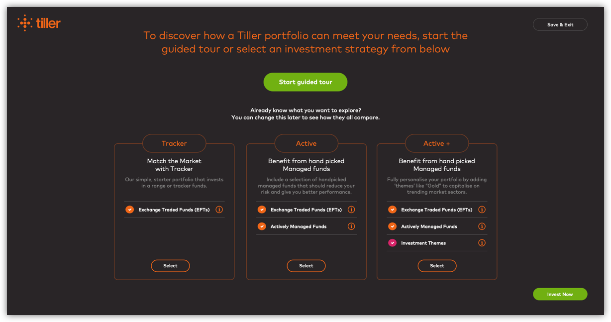
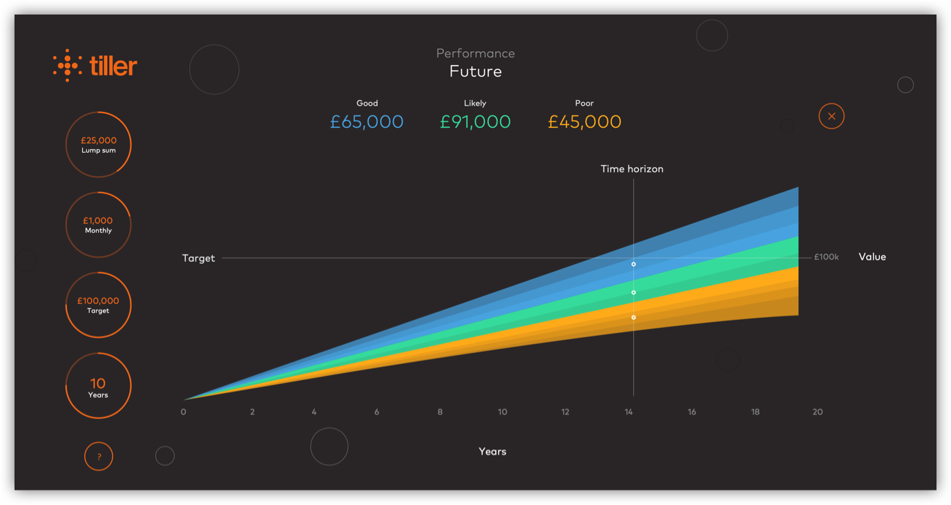
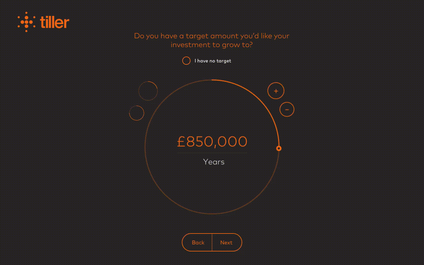
Upon singing up or during the DEMO new users go through the onboarding process. During this process the platform identify their risk profile based on their choices. Users can play with the parameters and see how their portfolio would perform over a certain period of time.
ONBOARDING
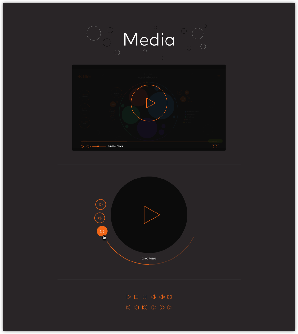
I created in After Effects a series of UI animations showing screen transitions and micro-interactions. In this example we can see a bit of the onboarding process. After setting up the initial investment deposit and investment time period users can play around adding assets to their portfolio to check the investment potential.
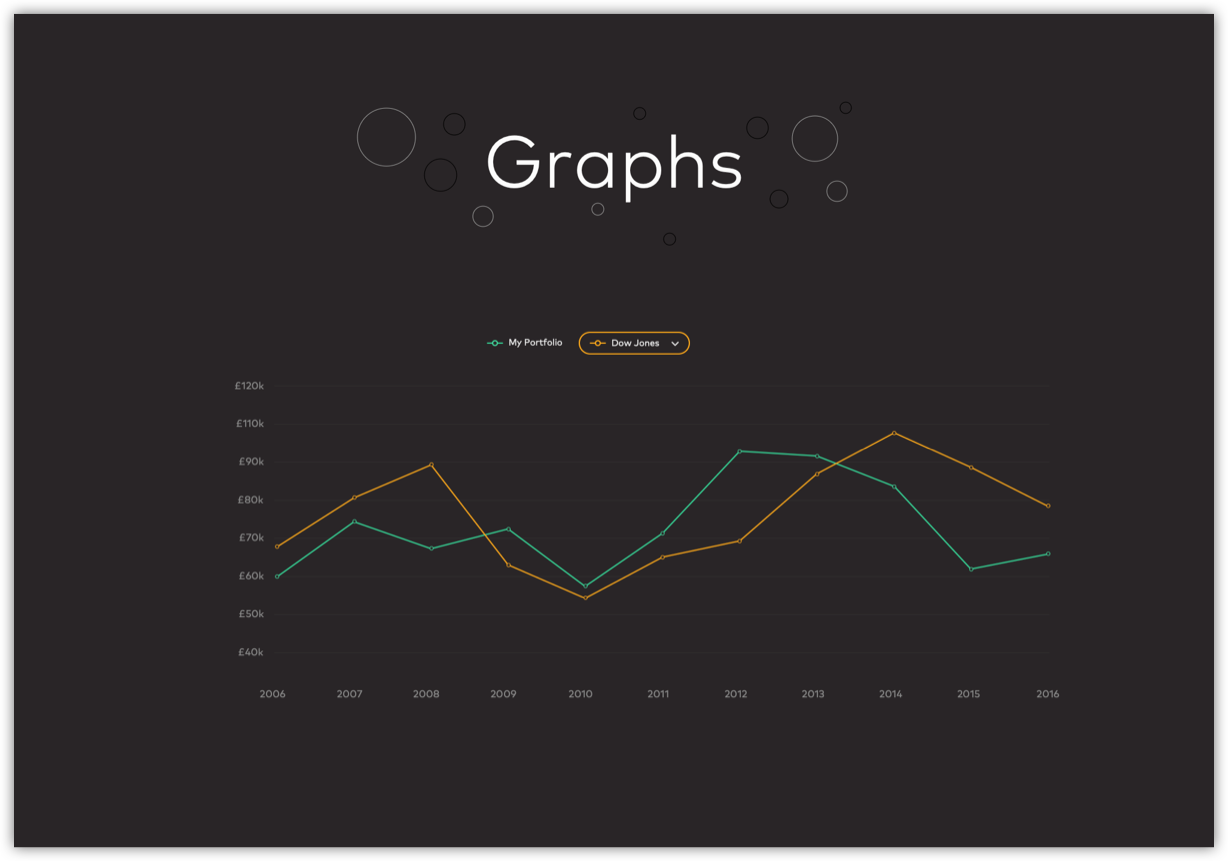
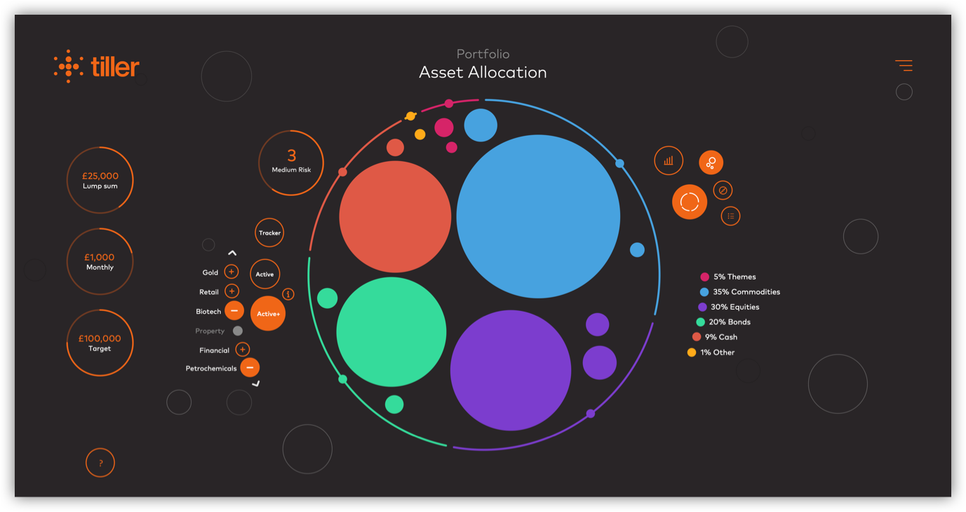
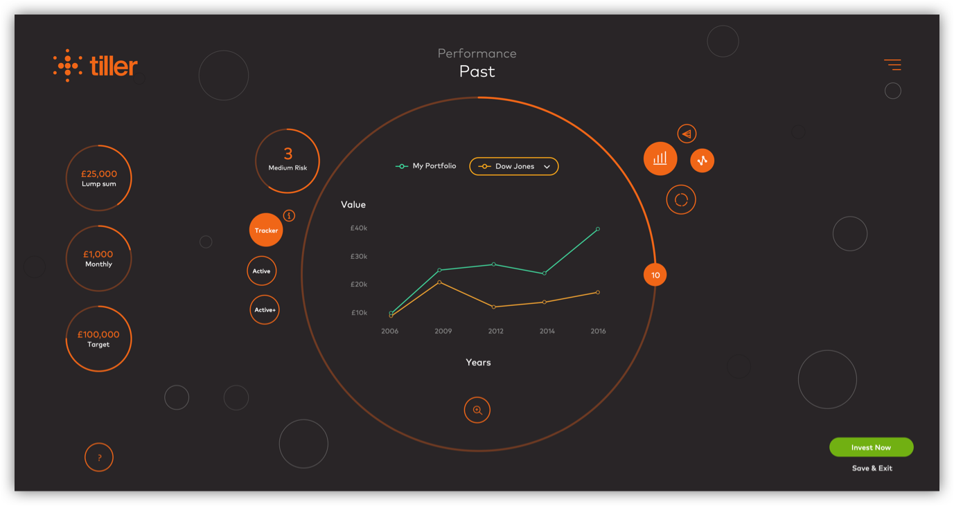
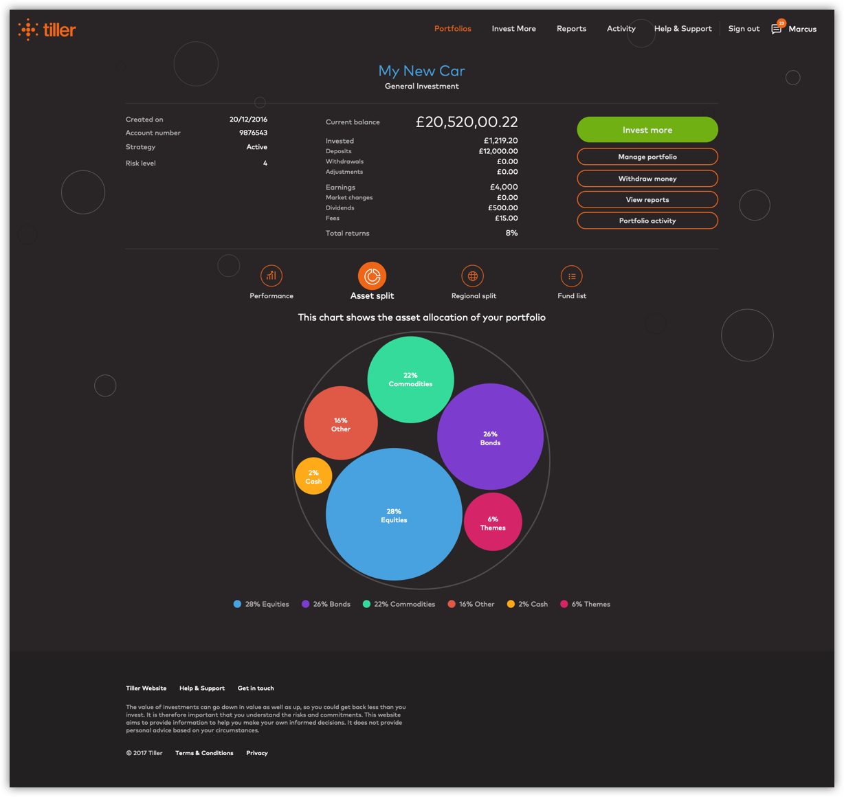
PORTFOLIO ANALYSIS
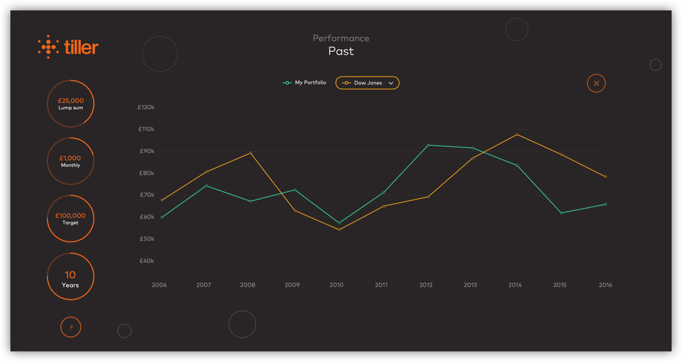
By expanding the graph in full screen, users have a more granular view of their investment.
ASSET ANALYSIS
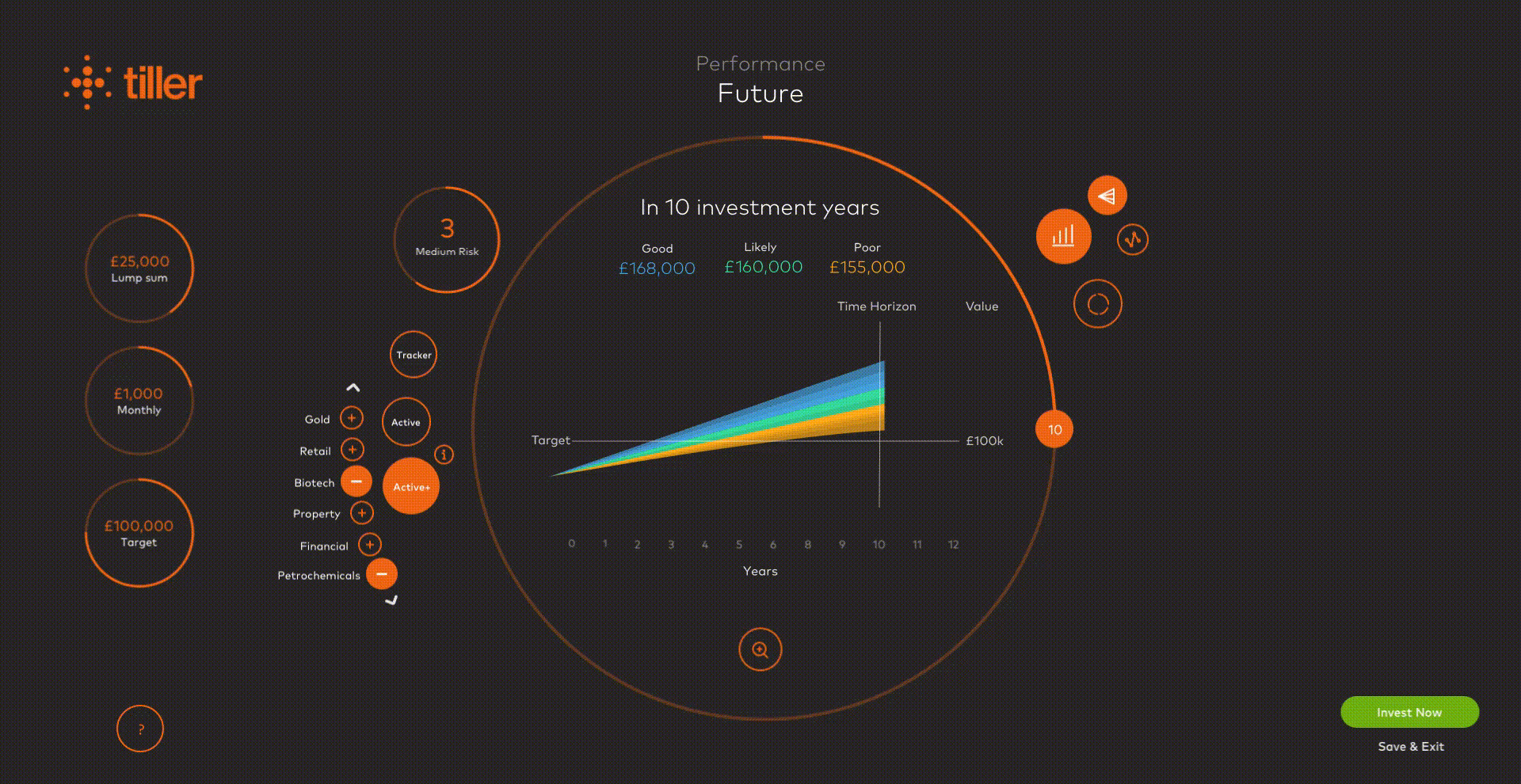
Users can drill down into the asset allocation and find out more about their performance. This provides great insights on the risk based on their performance history.
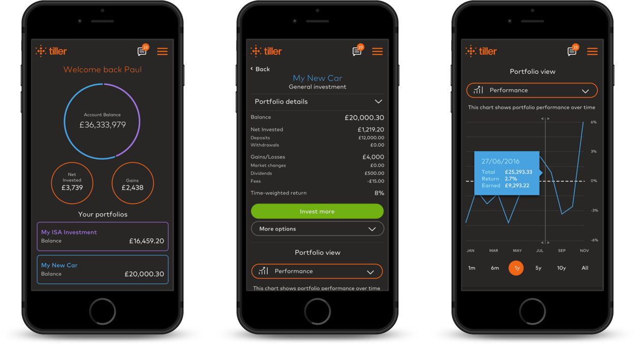
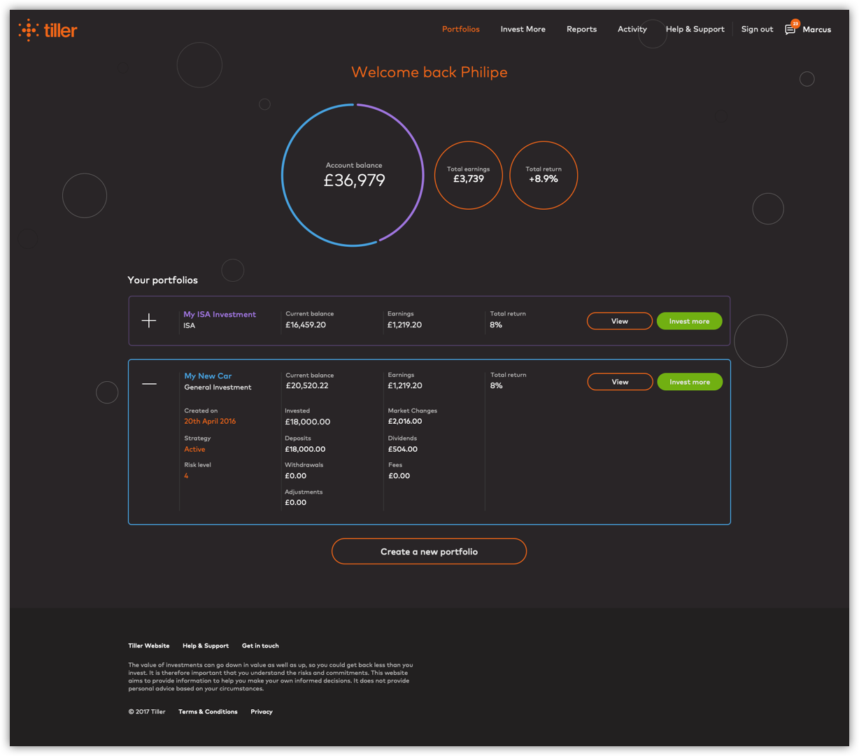
DASHBOARD
Taking a mobile first approach I designed a dashboard which users can very easily manage their investment portfolios.
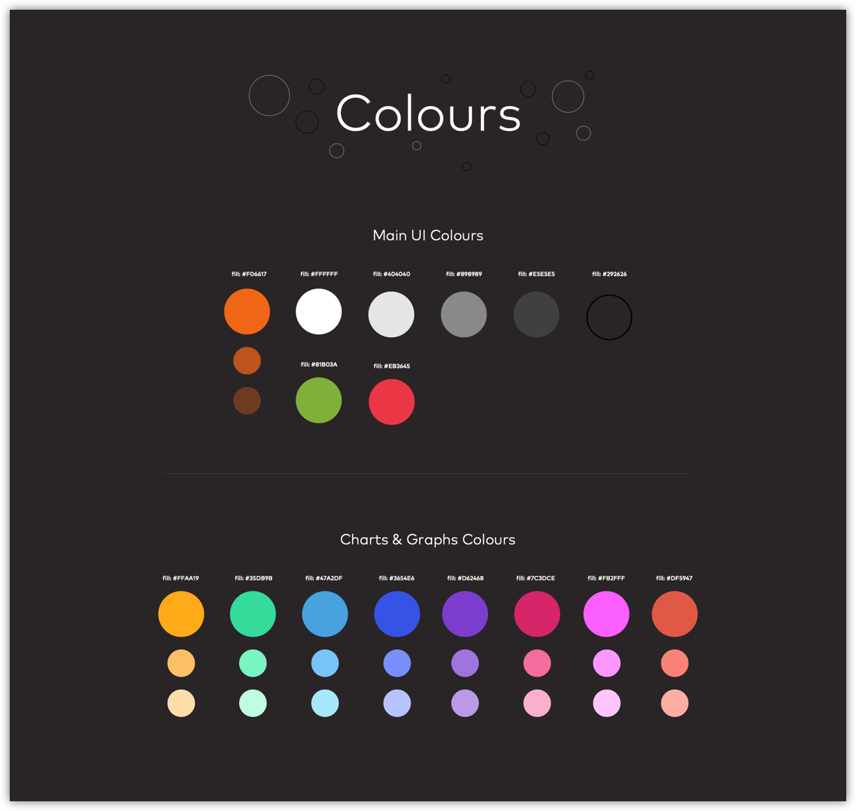
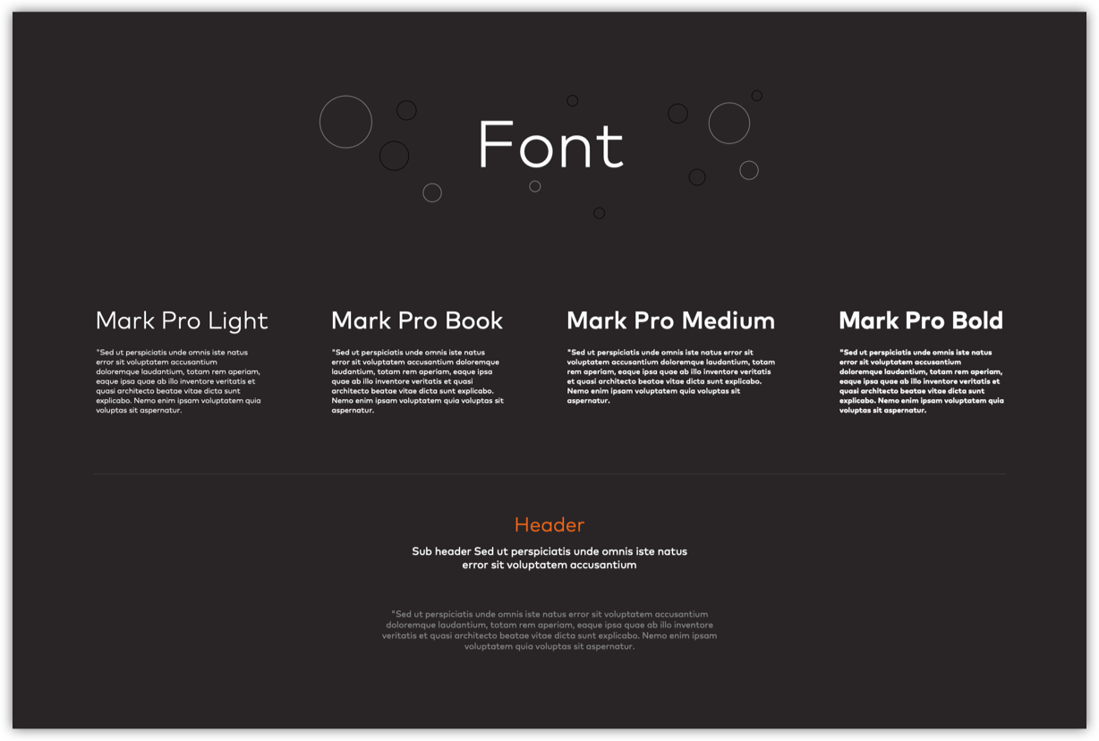
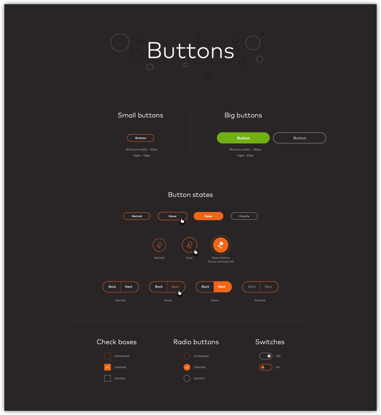
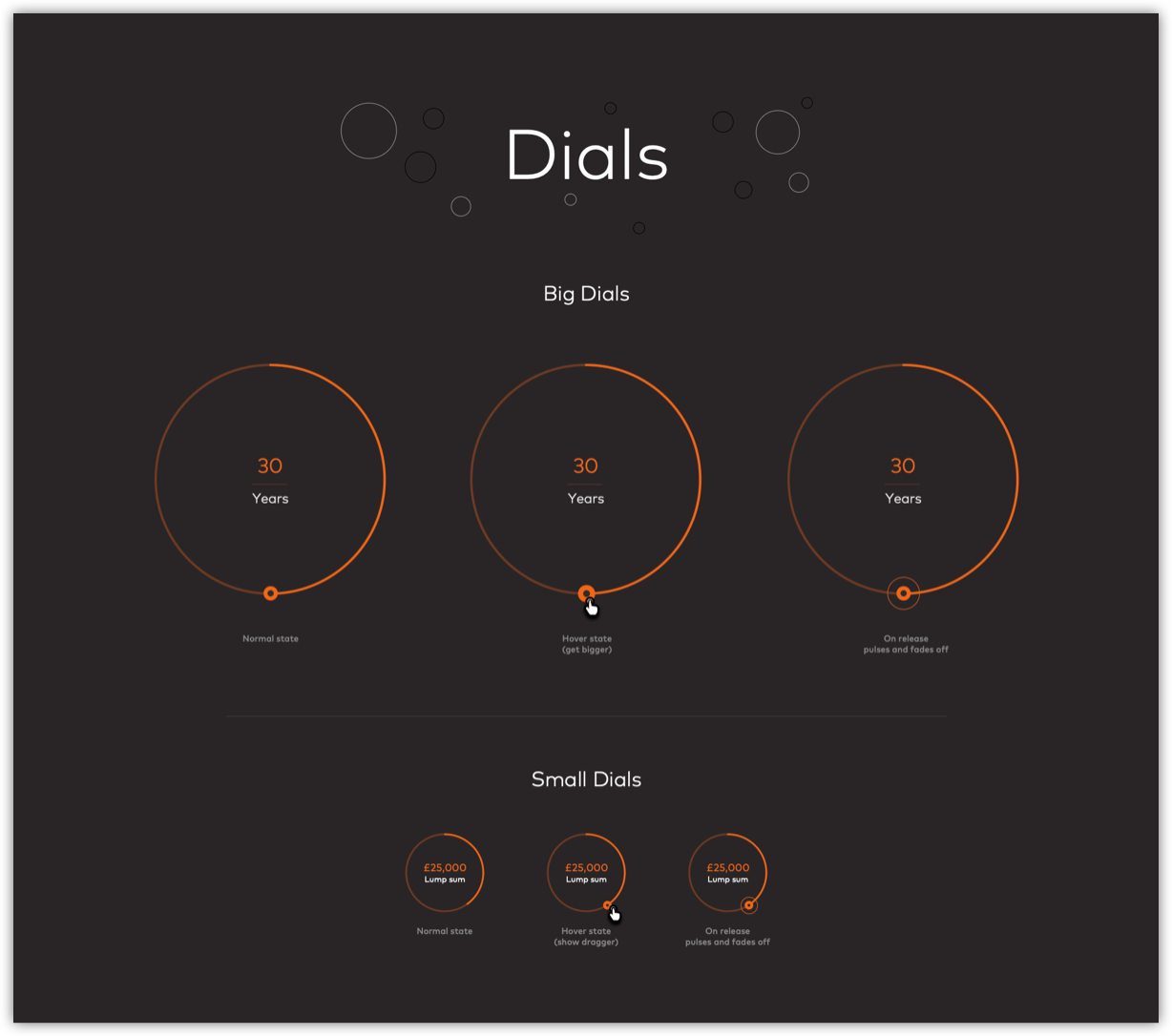
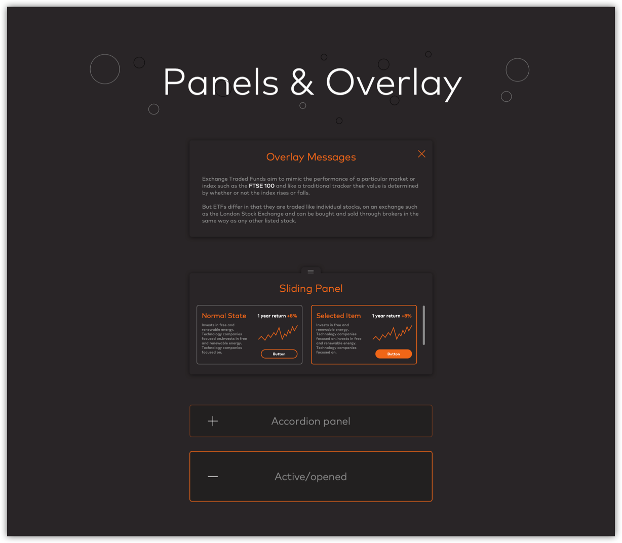
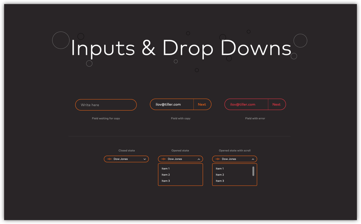
DESIGN SYSTEM
To facilitate the Product Design workflow I created a library of responsive components in order to maintain consistency across all UIs. Initially, I experimented with a variety of options aiming to establish and stress-test a style and library of components and patterns.
Once I found the right approach, I created a responsive library of UI components, and exported via Sketch Library.
This allowed the broader team to quickly reuse and construct UIs, flows, etc... using consistent pre-made, editable and flexible Sketch symbols.